Diverging Plots
diverge_plot_examples.RmdThe tcdsb package includes 2 functions to create
diverging plots to visualise data that have diverging categories,
e.g. survey questions with response categories like Strongly Disagree
-> Strongly Agree.
The function requires summary data in a long format, with a group column (i.e. question), response column (i.e. survey responses) and a percent column.
Create sample data
The function will take categories with 2, 4 and 6 levels (excluding any neutral or missing). Here we create a summary table for 6 levels - Strongly Disagree, Somewhat Disagree, Disagree, Neutral, Agree, Somewhat Agree, Strongly Agree)
# Make Dummy Data ----------------------------

set.seed(123)  # For reproducibility

# Function to generate percentages that sum to 100
generate_row <- function(n) {
  probs <- runif(n)
  probs / sum(probs)
}

survey_results_2 <- tibble(
  Question = paste0("Q", 1:5)
  ) |>
  rowwise()  |>
  mutate(
    values = list(generate_row(4)),
    Disagree = values[1],
    Neutral = values[2],
    Agree = values[3],
    Missing = values[4]
    ) |>
  select(-values) |>
  ungroup()|>
  pivot_longer(
    cols = c(`Disagree`:Missing),
    names_to = "response",
    values_to = "percent"
  )

survey_results_4 <- tibble(
  Question = paste0("Q", 1:5)
) |>
  rowwise()  |>
  mutate(
    values = list(generate_row(8)),
    `Strongly Disagree` = values[1],
    Disagree = values[2],
    Neutral = values[3],
    Agree = values[4],
    `Strongly Agree` = values[5],
    Missing = values[6]
  ) |>
  select(-values) |>
  ungroup()|>
  pivot_longer(
    cols = c(`Strongly Disagree`:Missing),
    names_to = "response",
    values_to = "percent"
  )

survey_results_6 <- tibble(
  Question = paste0("Q", 1:5)
) |>
  rowwise()  |>
  mutate(
    values = list(generate_row(8)),
    `Strongly Disagree` = values[1],
    `Somewhat Disagree` = values[2],
    Disagree = values[3],
    Neutral = values[4],
    Agree = values[5],
    `Somewhat Agree` = values[6],
    `Strongly Agree` = values[7],
    Missing = values[8]
  ) |>
  select(-values) |>
  ungroup()|>
  pivot_longer(
    cols = c(`Strongly Disagree`:Missing),
    names_to = "response",
    values_to = "percent"
  )
survey_results_2
#> # A tibble: 20 × 3
#>    Question response percent
#>    <chr>    <chr>      <dbl>
#>  1 Q1       Disagree  0.121
#>  2 Q1       Neutral   0.333
#>  3 Q1       Agree     0.173
#>  4 Q1       Missing   0.373
#>  5 Q2       Disagree  0.391
#>  6 Q2       Neutral   0.0189
#>  7 Q2       Agree     0.219
#>  8 Q2       Missing   0.371
#>  9 Q3       Disagree  0.228
#> 10 Q3       Neutral   0.189
#> 11 Q3       Agree     0.396
#> 12 Q3       Missing   0.187
#> 13 Q4       Disagree  0.301
#> 14 Q4       Neutral   0.254
#> 15 Q4       Agree     0.0457
#> 16 Q4       Missing   0.399
#> 17 Q5       Disagree  0.157
#> 18 Q5       Neutral   0.0268
#> 19 Q5       Agree     0.209
#> 20 Q5       Missing   0.608
survey_results_4
#> # A tibble: 30 × 3
#>    Question response          percent
#>    <chr>    <chr>               <dbl>
#>  1 Q1       Strongly Disagree  0.156
#>  2 Q1       Disagree           0.121
#>  3 Q1       Neutral            0.112
#>  4 Q1       Agree              0.174
#>  5 Q1       Strongly Agree     0.115
#>  6 Q1       Missing            0.124
#>  7 Q2       Strongly Disagree  0.0674
#>  8 Q2       Disagree           0.0343
#>  9 Q2       Neutral            0.224
#> 10 Q2       Agree              0.210
#> # ℹ 20 more rows
survey_results_6
#> # A tibble: 40 × 3
#>    Question response          percent
#>    <chr>    <chr>               <dbl>
#>  1 Q1       Strongly Disagree  0.155
#>  2 Q1       Somewhat Disagree  0.0220
#>  3 Q1       Disagree           0.0892
#>  4 Q1       Neutral            0.0638
#>  5 Q1       Agree              0.189
#>  6 Q1       Somewhat Agree     0.104
#>  7 Q1       Strongly Agree     0.188
#>  8 Q1       Missing            0.189
#>  9 Q2       Strongly Disagree  0.197
#> 10 Q2       Somewhat Disagree  0.109
#> # ℹ 30 more rows
Generate Plots
Any neutral or missing levels needs to be filtered out from the original summary data - they are added back in later. Users need to supply the following arguments:
-
group_col: Column with group of questions
-
response_col: Column response categories
-
percent_col: Column with with calculated percent
-
fct_levels: List of factor levels
Other arguments that can modified include:
-
font: Default set to “Century Gothic”
-
low_colour: Hex colour for low end of factor levels
-
high_colour: Hex colour for high end of factor levels
-
font_size: Set to 1, scales the font. (i.e.font_size= 1.1 increases font size by 10%,font_size= 0.9 decreases font size by 10%)
-
left_label: String to label left side of plot
-
right_label: String to label right side of plot
-
bar_width: Width of bars
Two-Factor Plots
Here we take a summary data frame with 2 factors and apply the
tcdsb_diverge_plot_function.
plot2 <- survey_results_2 |>
  dplyr::filter(!response %in% c("Missing", "Neutral")) |>
  tcdsb::tcdsb_diverge_plot_function(
    group_col = Question,                 # Group of questions
    response_col = response,              # Response categories
    percent_col = percent,                # Column with calculated percent
    fct_levels = c("Disagree", "Agree")   # Factor levels
  )

plot2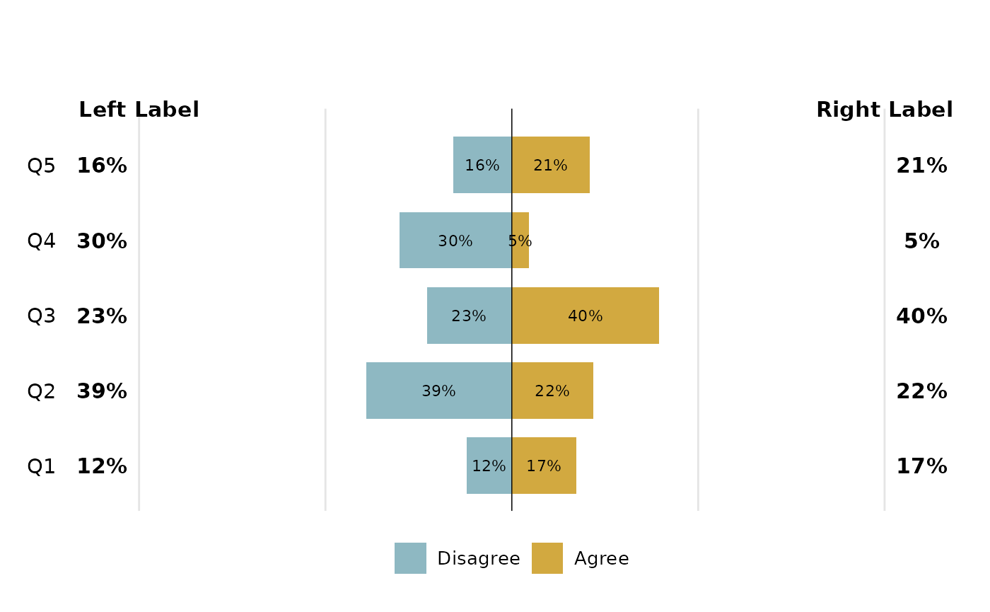
Here is the same plot, but with additional arguments passed to it
plot2 <- survey_results_2 |>
  dplyr::filter(!response %in% c("Missing", "Neutral")) |>
  tcdsb::tcdsb_diverge_plot_function(
    group_col = Question,                 # Group of questions
    response_col = response,              # Response categories
    percent_col = percent,                # Column with calculated percent
    fct_levels = c("Disagree", "Agree"),  # Factor levels
    left_label = "Total Disagree",
    right_label = "Total Agree",
    low_colour = "darkgoldenrod",
    high_colour = "chartreuse3"
  )
plot2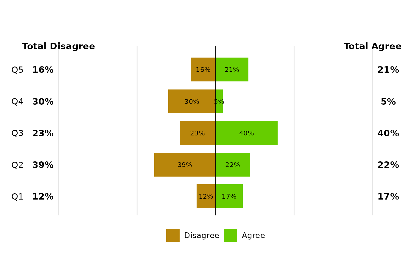
The second function is the
tcdsb_diverge_plot_other_function. This creates a separate
bar for neutral, or missing categories.
plot2_missing <- survey_results_2 |>
  dplyr::filter(response == "Missing") |>
  tcdsb::tcdsb_diverge_plot_other_function(
    group_col = Question,
    response_col = response,
    percent_col = percent,
    label = "Missing"
  )

plot2_neutral <- survey_results_2 |>
  dplyr::filter(response == "Neutral") |>
  tcdsb::tcdsb_diverge_plot_other_function(
    group_col = Question,
    response_col = response,
    percent_col = percent,
    label = "Neutral"
  )
plot2_missing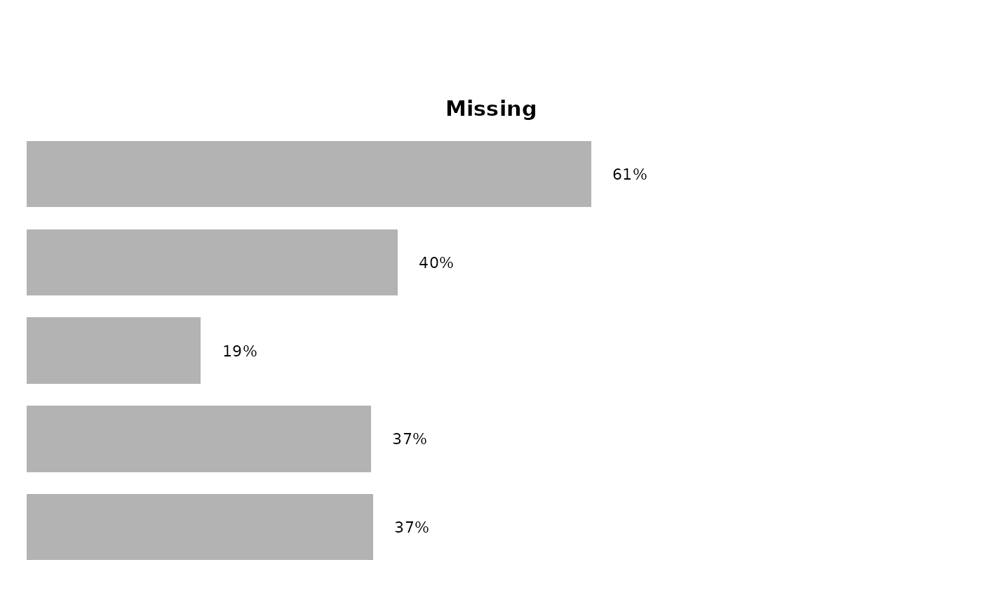
plot2_neutral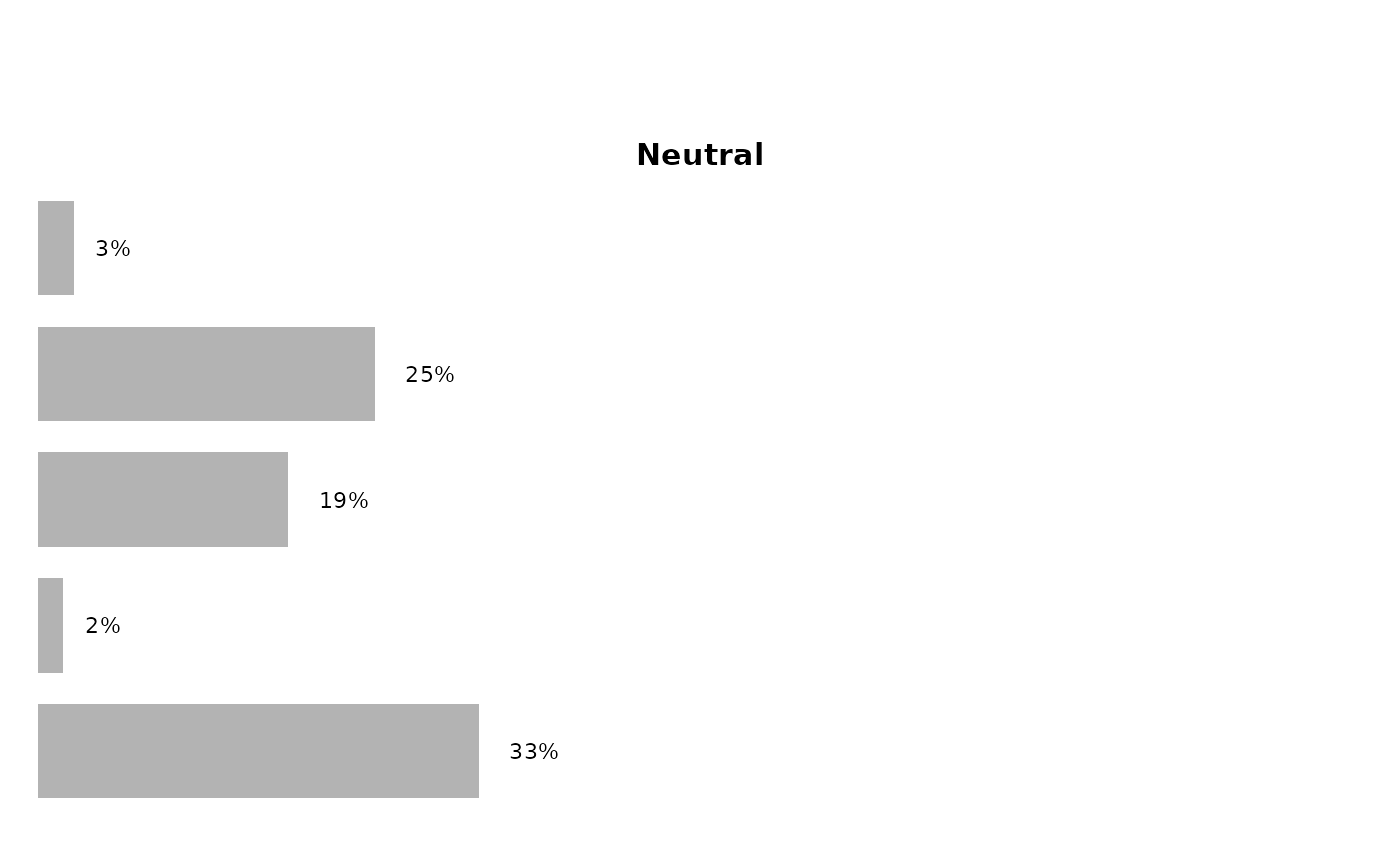
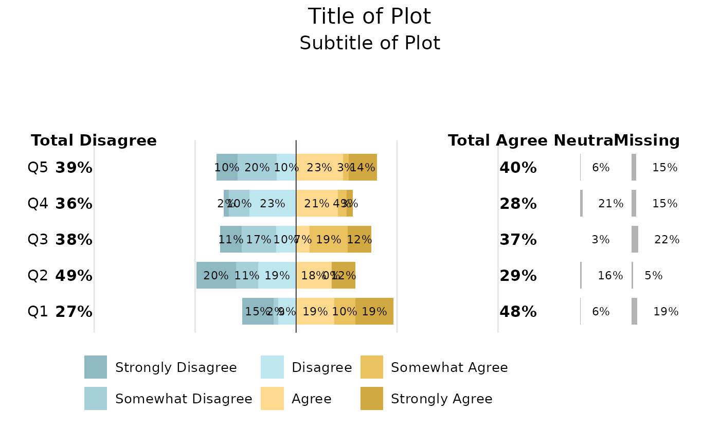
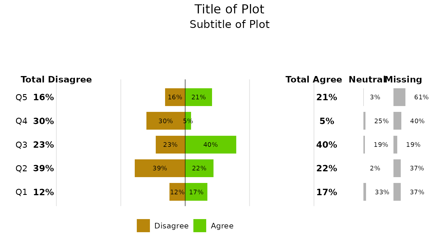
Finally, using the patchwork package, we can stitch them
all together into a single plot.
library(patchwork)

(plot2 + plot2_neutral + plot2_missing ) +
  plot_layout(widths = c(4, 0.1, 0.25, 0.25)) +
    plot_annotation(
      title = "Title of Plot",
      subtitle = "Subtitle of Plot",
      theme = theme(
        plot.title = element_text(
          hjust = 0.5, # Centers the title
          family = "Century Gothic", # Specifies the font family
          size = 16, # Adjusts font size
          color = "black" # Sets font color
        ),
        plot.subtitle = element_text(
          hjust = 0.5, # Centers the title
          family = "Century Gothic", # Specifies the font family
          size = 14, # Adjusts font size
          color = "black" # Sets font color
        ),
        legend.position = "bottom",
        legend.justification = "left",
        legend.box.just = "left"
      )
    )
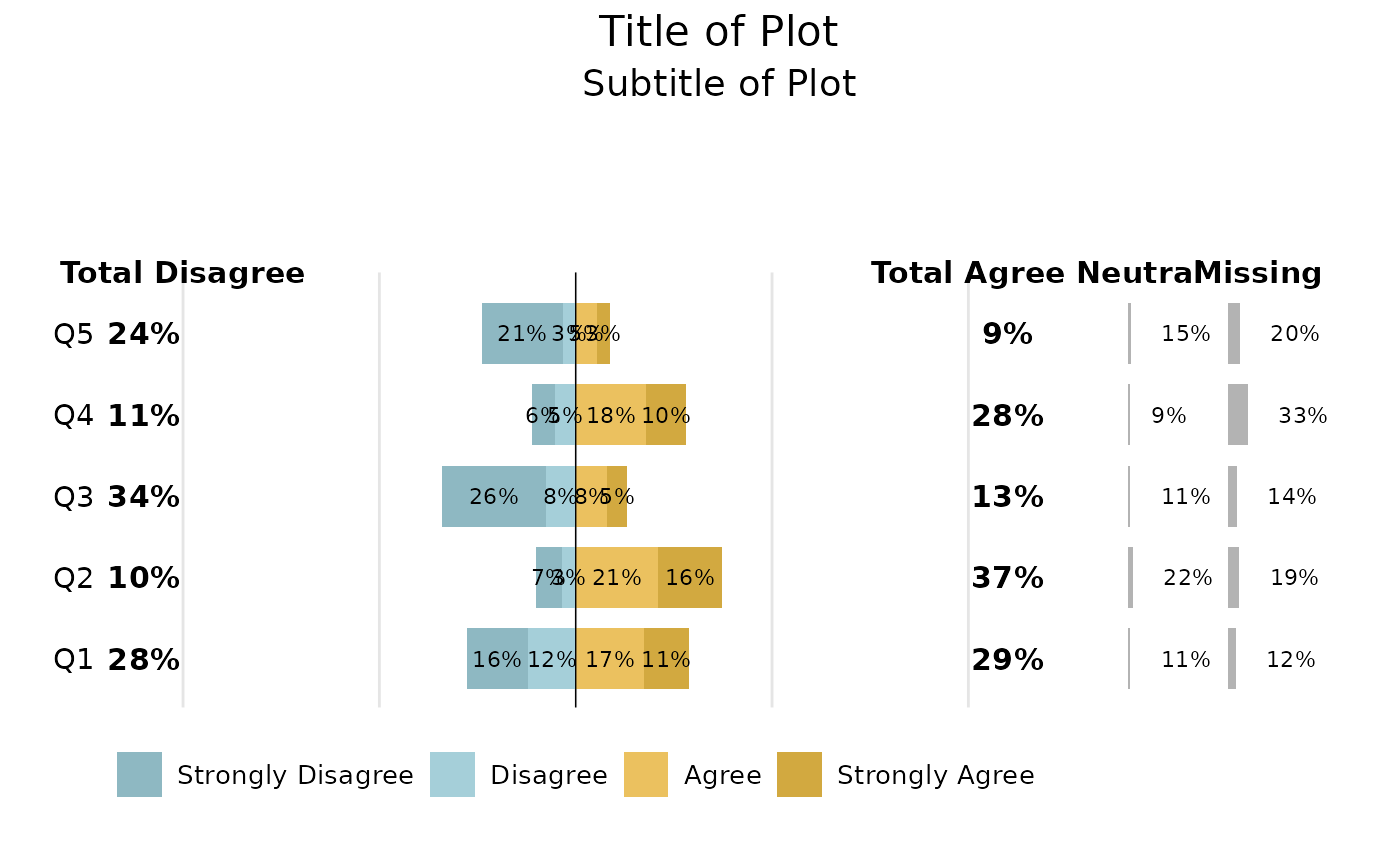
Four-Factor Plot
plot4 <- survey_results_4 |>
  dplyr::filter(!response %in% c("Missing", "Neutral")) |>
  tcdsb::tcdsb_diverge_plot_function(
    group_col = Question,                 # Group of questions
    response_col = response,              # Response categories
    percent_col = percent,                # Column with calculated percent
    fct_levels = c("Strongly Disagree", "Disagree", "Agree", "Strongly Agree"),  # Factor levels
    left_label = "Total Disagree",
    right_label = "Total Agree"
    )

plot4_missing <- survey_results_4 |>
  dplyr::filter(response == "Missing") |>
  tcdsb::tcdsb_diverge_plot_other_function(
    group_col = Question,
    response_col = response,
    percent_col = percent,
    label = "Missing"
  )

plot4_neutral <- survey_results_4 |>
  dplyr::filter(response == "Neutral") |>
  tcdsb::tcdsb_diverge_plot_other_function(
    group_col = Question,
    response_col = response,
    percent_col = percent,
    label = "Neutral"
  )

(plot4 + plot4_neutral + plot4_missing ) +
  plot_layout(widths = c(4, 0.1, 0.25, 0.25)) +
    plot_annotation(
      title = "Title of Plot",
      subtitle = "Subtitle of Plot",
      theme = theme(
        plot.title = element_text(
          hjust = 0.5, # Centers the title
          family = "Century Gothic", # Specifies the font family
          size = 16, # Adjusts font size
          color = "black" # Sets font color
        ),
        plot.subtitle = element_text(
          hjust = 0.5, # Centers the title
          family = "Century Gothic", # Specifies the font family
          size = 14, # Adjusts font size
          color = "black" # Sets font color
        ),
        legend.position = "bottom",
        legend.justification = "left",
        legend.box.just = "left"
      )
    )
Six-Factor Plot
plot6 <- survey_results_6 |>
  dplyr::filter(!response %in% c("Missing", "Neutral")) |>
  tcdsb::tcdsb_diverge_plot_function(
    group_col = Question,                 # Group of questions
    response_col = response,              # Response categories
    percent_col = percent,                # Column with calculated percent
    fct_levels = c("Strongly Disagree", "Somewhat Disagree", "Disagree", "Agree", "Somewhat Agree", "Strongly Agree"),  # Factor levels
    left_label = "Total Disagree",
    right_label = "Total Agree"
    )

plot6_missing <- survey_results_6 |>
  dplyr::filter(response == "Missing") |>
  tcdsb::tcdsb_diverge_plot_other_function(
    group_col = Question,
    response_col = response,
    percent_col = percent,
    label = "Missing"
  )

plot6_neutral <- survey_results_6 |>
  dplyr::filter(response == "Neutral") |>
  tcdsb::tcdsb_diverge_plot_other_function(
    group_col = Question,
    response_col = response,
    percent_col = percent,
    label = "Neutral"
  )

(plot6 + plot6_neutral + plot6_missing ) +
  plot_layout(widths = c(4, 0.1, 0.25, 0.25)) +
    plot_annotation(
      title = "Title of Plot",
      subtitle = "Subtitle of Plot",
      theme = theme(
        plot.title = element_text(
          hjust = 0.5, # Centers the title
          family = "Century Gothic", # Specifies the font family
          size = 16, # Adjusts font size
          color = "black" # Sets font color
        ),
        plot.subtitle = element_text(
          hjust = 0.5, # Centers the title
          family = "Century Gothic", # Specifies the font family
          size = 14, # Adjusts font size
          color = "black" # Sets font color
        ),
        legend.position = "bottom",
        legend.justification = "left",
        legend.box.just = "left"
      )
    )